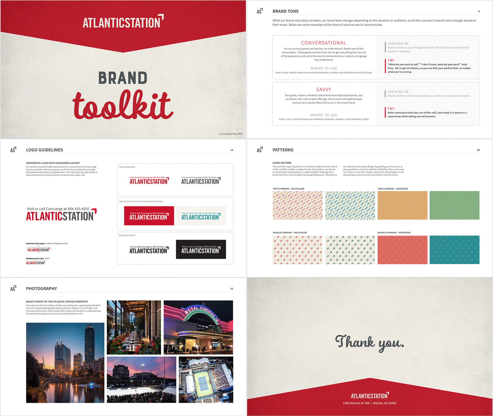
Atlantic Station Brand System
An industrial past meets a more human future.
CATEGORY
Brand Strategy
Brand Design
Environmental Design
Print & Digital Ads
Web Design
OPPORTUNITY
The Atlantic Station brand had seen a few facelifts since the property first broke ground in 2005, but with an increasingly growing list of competition around the city and beyond, Atlantic Station sought a refreshed brand voice, tone, and visual identity to accompany its existing logo—all during a time of massive renovation and reinvention—to reestablish itself as a live/work/play hub for both new and returning visitors.
PROCESS
In the early discovery stages, I learned that Atlantic Station has its own ZIP code for the entire live/work/play area, and the land had deep roots in the industrial economy dating back to the early 1900s. Geographically placed at the heart of Atlanta, I aimed to create a visual system that celebrates its industrial past while creating an inviting, inclusive space with “heart”.
During the process of building out an extended style guide, I created an all-new brand color palette, introduced secondary fonts, created a series of patterns and textures, and built sample posters and promotional items in the new brand style—all in an effort to showcase a lighter, brighter and more inviting face of Atlantic Station. This system also included a small collateral package as well as a website proof of concept.
Brand Guide
Less of a strict rules book, more of an asset toolkit.


